The current SARS-CoV-2 pandemic poses a major challenge for Intensive Care Units (ICUs).1 In the last few months, the capacity of these Units has been drastically incremented, with the need to habilitate other hospital areas not initially conceived to hold critically ill patients.2
Sufficient means are clearly needed to deal with future outbreaks. In this regard, dashboards generated from the data contained in the clinical information system (CIS) offer a graphic display of relevant information on the patient condition and course. Dashboards facilitate critical patient care, offering important clinical information intuitively and in a way that is easy to interpret. They generate alerts when key parameters move beyond acceptable limits, allowing immediate corrective actions and constituting genuine clinical decision supporting tools.3 Likewise, the pandemic has evidenced the need to upgrade the traditional models and to include different forms of “telecommuting” or “remote care” in medical practice.4
It is clear that information technology offers an excellent opportunity to improve patient care.5 Specifically, CIS integrate the information from other Departments, point of care devices and laboratory test results, drug prescriptions and specific information recorded by the healthcare professionals. Nevertheless, the latter must make important efforts to obtain the required information globally and on a real-time basis in order to ensure effective and efficient organization.6
During the peak of the COVID-19 care crisis in our Unit, we developed a series of dashboards from the information available in the CIS that allowed us to monitor the patients on a remote basis, improving the safety and quality of care in moments of maximum healthcare burden. A recent review has shown that the use of dashboards improves efficiency in routine clinical practice, clinician satisfaction, patient safety and reliability of the working environment.7
The entire application has been programmed in a controlled environment, independently of the operating system, using Docker. The data are extracted in real time from the CIS through ETL processes using Python, and are displayed via website programmed with the web standards (html, JavaScript and css) using the Django framework.
We first developed a general dashboard allowing us to quickly assess the level of complexity and the life support requirements of each patient in each of the Units (mechanical ventilation, extrarenal replacement therapy or vasoactive support). This dashboard allows rapid visualization of the distribution of resources and the care burden in the Unit.
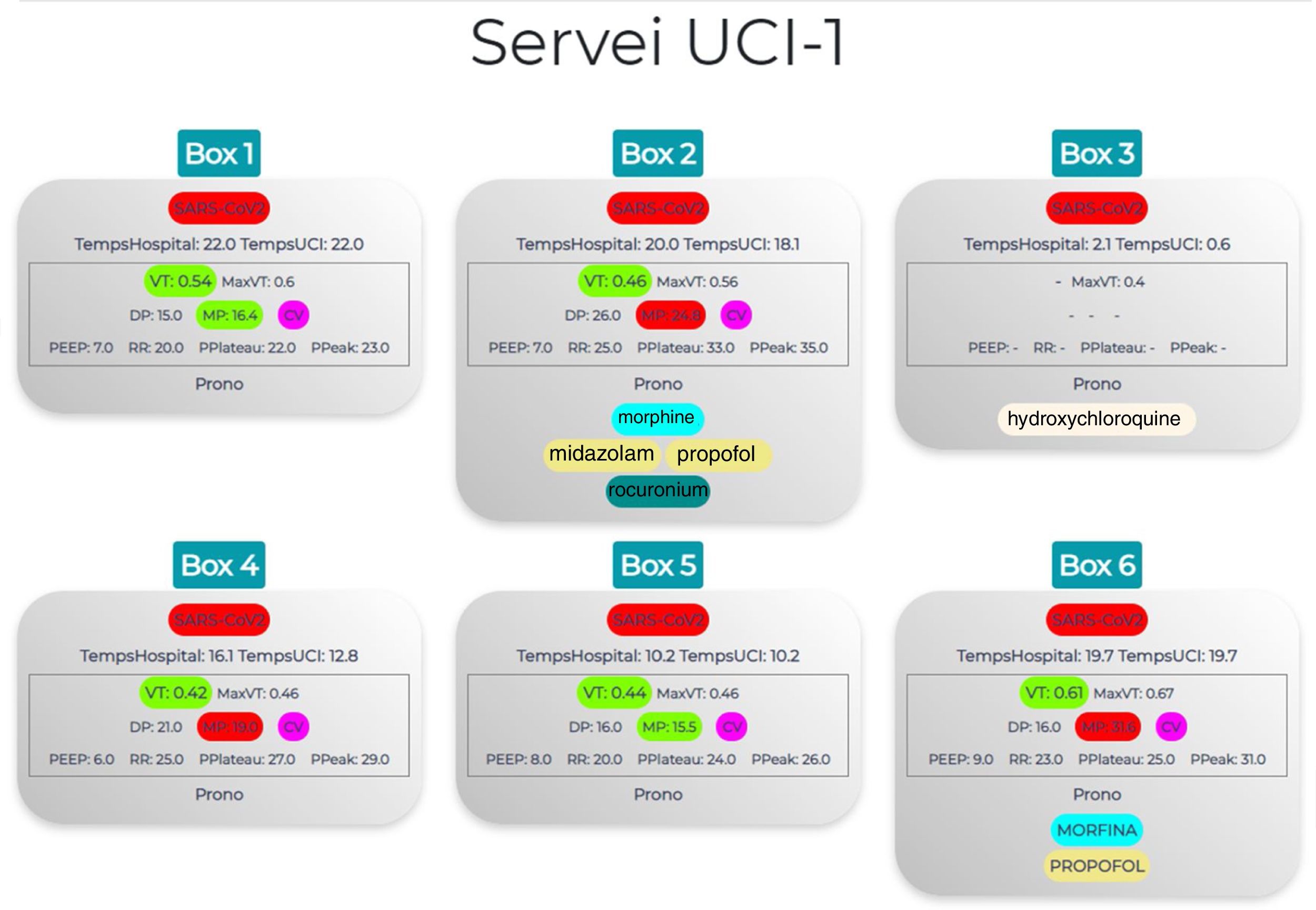
A second dashboard in turn focuses specifically on ventilatory support (Fig. 1), exhibiting the ventilation mode, parameters and mechanics. In addition, certain parameters such as tidal volume are displayed in different colors according to whether the values fall within the advisable range or not. This allows us to quickly identify which patients are receiving a tidal volume outside the limits of 6-7ml/kg, or whether we need to modify parameters in order to secure adequate mechanical power. This dashboard also allows us to quickly identify drug perfusions and doses, as well as which patients are in prone decubitus – facilitating the management and organization of tasks and daily pronation or supination maneuvering of these patients.
Treatment and ventilatory support dashboard. We first examine (marked in red) whether the patient is isolated due to SARS-CoV-2 positivity and the duration of UCI and hospital stay. The central panel displays the mechanical ventilation monitoring parameters in colors according to whether they are within the adequate range or not (Vt: green if within range, yellow if > 5%, orange if > 5-10%, red if > 10%; MP: green if ≤ 18, red if > 18). Lastly, an orange color indicates whether the patient is in prone decubitus and what sedoanalgesia and/or neuromuscular relaxant is being provided in continuous perfusion. Vt: tidal volume; MaxVt: maximum tidal volume; DP: driving pressure; MP: mechanical power; CV: volume control; PEEP: positive end-expiratory pressure; RR: respiratory rate; PPlateau: plateau pressure; PPeak: peak pressure.
The effectiveness of dashboards is conditioned by adequate quality of the CIS data. As reported by Murillo-Cabezas et al., big data techniques can be of help in times of pandemic, though it is essential for the available data to be reliable.8 Our group has already shown that in order to achieve this, professional training and effort are crucial.9 The professionals must be well aware of the importance of adequate compilation of the data entered in the CIS – both those entered manually and those downloaded automatically from the different point of care devices and originating from other Departments (laboratory test results). It is necessary to check that the devices are properly connected and that the information they afford is reliable and generated on a real-time basis. All this will help to reach our objectives, shortening the identification and response times in situations of increased work burden, and monitoring an maintaining the necessary quality and safety standards.
Financial supportFondo de Investigación Sanitaria (Instituto de Salud Carlos III, project PI16/00491). Agència de Gestió d'Ajuts Universitaris i de Recerca 2017 SGR 00127. European Regional Development Fund.
Please cite this article as: Claverias L, Gómez J, Rodríguez A, Albiol J, Esteban F, Bodí M. Soporte a la organización de las Unidades de Cuidados Intensivos durante la pandemia, a través de mapas creados a partir de los Sistemas de Información Clínica. Med Intensiva. 2021;45:58–60.


